|
Oracle® BPEL Process Analytics User's Guide
10g Release 2 (10.1.2) Part No. B15597-01 |
|
 Previous |
 Next |
|
Oracle® BPEL Process Analytics User's Guide
10g Release 2 (10.1.2) Part No. B15597-01 |
|
 Previous |
 Next |
After an administrator configures the Dashboard and assigns pages to Oracle BPEL Process Analytics user accounts, an end user, such as a business analyst, can use the Oracle BPEL Process Analytics Dashboard to view and analyze the metrics, KPIs, and events to which the administrator has given that user access.
Because the Oracle BPEL Process Analytics administrator can customize the Dashboard for each user, this chapter cannot provide step-by-step instructions for using the Dashboard. Instead, it provides details about using each of the components the administrator can make available through the Dashboard. Your particular Dashboard configuration may or may not make all components available to you. If you find a desired page, chart, or table described in this chapter that you do not have in your Dashboard, discuss it with your Oracle BPEL Process Analytics administrator.
This chapter includes the following topics:
The method for logging in to the Dashboard varies, depending on whether you are using a Microsoft Windows or Unix system, as follows:
On Microsoft Windows Systems:
On the desktop, click Start, then choose All Programs, then Oracle – OAS_Home_Name, then Oracle BPEL Process Analytics, and then click BPA Console. The default Web browser opens and presents the Login to Oracle BPEL Process Analytics page.
Enter the username and password given to you by your Oracle BPEL Process Analytics administrator, and then click Login.
When you are done using the Dashboard, click Logout (in the upper-right side of the browser window).
On Unix Systems:
Open a supported Web browser and enter the following URL, where host is the host system where Oracle BPEL Process Analytics is running and port is the port on which it is running:
http://host:port/bam/pages/login.uix
Ask your Oracle BPEL Process Analytics administrator for the host and port values (which were presented to him or her at the end of the Oracle BPEL Process Analytics installation).
Enter the username and password given to you by your Oracle BPEL Process Analytics administrator, and then click Login.
When you are done using the Dashboard, click Logout (in the upper-right side of the browser window).
After you log in, the interface opens and presents the Dashboard, unless the account you are using has Oracle BPEL Process Analytics administrator privileges. If the account has such administrator privileges, the Admin Console opens; click Dashboard to view the Dashboard.
|
Note: Be sure to close your Web browser after you log out of the Oracle BPEL Process Analytics Console, to ensure that others cannot view Console pages using the Web browser's Back button. |
The Dashboard is a collection of pages, called views, that present data in a variety of charts and tables. You select which one to display by making a selection from the Switch View box. The names and contents of the available views are determined by the Oracle BPEL Process Analytics administrator who configured your Dashboard.
In addition to a variety of views available from the Switch View box, details about the data within the views are presented in detail pages when you click a data point within a view. (In the case of radar charts, you click a KPI label.) This process is referred to as drilling down.
The following topics introduce the views and detail pages:
Depending on how the administrator configured the Dashboard, the first view you see when you log in to the Dashboard is one of the following:
The Real-Time Viewer
This view presents composite events in real time. By default, all dimensions of the composite event are displayed. You can adjust which composite events are displayed, the dimensions displayed, the time window over which the data is presented, and so on. Data in the Real-Time Viewer is refreshed every minute, by default.
In addition, this page presents a table of data. The table displays aggregate values of the data shown in the chart.
Figure 4-1 shows a sample Real-Time Viewer.
A mulitpane view
A multiple pane view is a default, or administrator-configured, view that consists of one or more charts, tables, or both. Each table or chart is presented within a pane in the view. As the name implies, a multiple pane view typically consists of more than one view pane.
The charts and tables in a multiple pane view can present KPIs, metrics, alerts, cause and effect data, or information about pending composite events. The content of each Dashboard view is specified by the administrator when configuring the Dashboard. Data in a multiple pane view is refreshed every two minutes, by default.
You can adjust the time frame over which the data is presented (year, quarter, month, or day).
Figure 4-2 shows a sample multiple pane view.
In addition to the page presented when you open the Dashboard, you can access more pages by making a selection from the Switch View box, or, by clicking data within a chart in a KPI multiple pane view, you can access detail pages for any KPI in that chart. Figure 4-3 shows the Performance detail page that is presented as a result of clicking a data point (a portion of the pie) in the Approvals by Provider chart presented in Figure 4-2, and then, in the Performance detail page, selecting a Value of None.
As shown on tabs within Figure 4-3, there are four detail pages available for each KPI:
Performance
This detail page shows how the selected KPI has performed for the selected time grain. If the administrator specified target values for the KPI, they can be included in the chart. See "Viewing and Understanding Performance Details" for more information.
Cause/Effect
This detail page shows the KPIs that influenced the value of the selected KPI and the KPIs that the selected KPI influences (for a given time grain). See "Viewing and Understanding Cause/Effect Tables – Performing Root-Cause Analysis" for more information.
Information
This detail page lists KPI context documents, if available. KPI context documents are documents that provide some textual information about the selected KPI. See "Viewing and Understanding KPI Context Documents" for more information.
Prediction
This detail page provides a prediction of the next KPI value for the current time grain. See "Viewing and Understanding KPI Predictions" for more information.
The Real-Time Viewer displays instances of events within a composite event as they occur. For this reason, it is typically the most meaningful page during initial use of Oracle BPEL Process Analytics.
To access the Real-Time Viewer, choose one of these methods:
In the Switch View box, select Real-Time Viewer.
In a multiple pane view pane, click the Real-Time Viewer icon in the upper- right corner of any view pane (except one containing an Alert View). The Real-Time Viewer icon is shown in Figure 4-4.
If a multiple pane view contains data from multiple composite events, then multiple Real-Time Viewer icons will be presented. Moving the cursor over any one of the Real-Time Viewer icons causes a pop-up window to open and display the composite event that will be displayed in the Real-Time Viewer if you click that icon.
The Real-Time Viewer page opens and presents composite event instances in a chart and statistics about the event instances in a table. Figure 4-1 shows a sample Real-Time Viewer.
You can make a variety of adjustments, as described in the following topics, to specify what is presented in the Real-Time Viewer:
To specify the window of time that you want the event window to present, click one of the four time values at the top of the page. By default, you are presented with increments of 60 minutes, 45 minutes, 30 minutes, or 15 minutes. You can adjust the increments displayed on the page by clicking the Change Time Options button and then selecting a new set of time values. Available time windows from which you can select are the following:
24 hours, 18 hours, 12 hours, 6 hours
4 hours, 3 hours, 2 hours, 1 hour
60 minutes, 45 minutes, 30 minutes, 15 minutes
10 minutes, 8 minutes, 5 minutes, 2 minutes
To change the composite event displayed in the Real-Time Viewer:
In the Composite Event box, select the composite event you want to display. Note that you can select standalone composite events (those not part of a composite event group) or composite event groups. However, composite events that are part of a composite event group are not presented in this box.
Standalone composite events and composite event groups are presented in the Real-Time Viewer as composite events. Composite events that are part of a composite event group are not displayed separately from the group.
Click Apply.
The Real-Time Viewer refreshes to display data for the selected composite event.
Using the Dimension control, you can specify that composite event instances be displayed along a dimension.
To specify the dimension to display:
In the Dimension box, select the dimension you want to display.
Click Apply.
The chart refreshes to present instances of the selected composite event along the selected dimension.
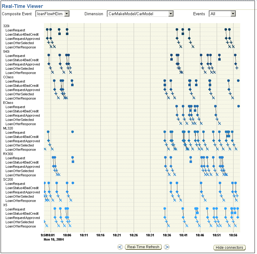
For example, using the loan flow example presented in Figure 1-1, suppose the administrator defined these two dimensions: CarMake and CarModel for auto loans. You can specify one of these dimensions as the category by which to present composite events in the Real-Time Viewer. Figure 4-5 shows the Real-Time Viewer when CarMake is selected as the dimension by which to categorize composite events; Figure 4-6 shows the Real-Time Viewer when CarModel is selected as the dimension by which to categorize composite events.
|
Note: If you select a dimension that was not included in the composite event when it was created, the refreshed chart displays data as though you selected All from the Dimension box, and displays a message that reads, "Warning: Dimensiondimension-name is not defined for composite event composite-event-name", where dimension-name is the dimension you selected and composite-event-name is the composite event you selected.
|
Figure 4-5 Real-Time Viewer with CarMake Dimension Selected
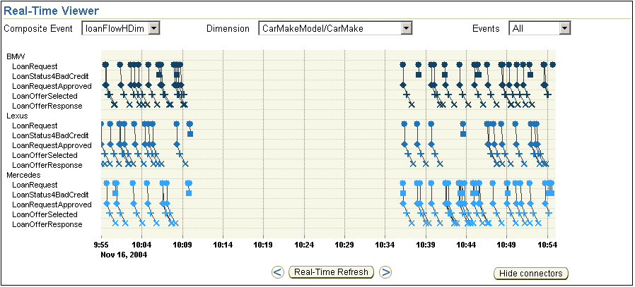
Figure 4-6 Real-Time Viewer with CarModel Dimension Selected
To specify the type of composite events that are included in the Real-Time Viewer:
In the Events box, select the type of composite event you want to display.
The text following this list describes the types from which you can choose.
Click Apply.
The Real-Time Viewer refreshes to display the selected type of composite events.
The types of composite events from which you can choose are as follows:
When you select All from the Events box, all event instances captured by Oracle BPEL Process Analytics are presented in the Real-Time Viewer (chart and table).
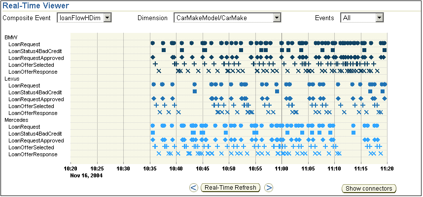
Figure 4-7 shows an example of a chart that contains all returned event instances, including timed-out events. Each marker (circle, diamond, square, plus sign, and x) represents a different event instance within each composite event instance. Line segments connect event instances that are part of the same composite event instance.
Complete
When you select Complete from the Events box, only composite event instances for which end events have been returned are presented in the Real-Time Viewer. Figure 4-8 shows an example of an chart that contains only complete composite events.
Pending
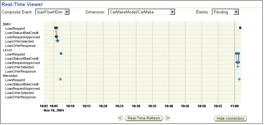
When you select Pending from the Events box, only composite event instances for which an end event has not yet been returned (and which are not timed out) are presented in the Real-Time Viewer. Figure 4-9 shows an example of an Real-Time Viewer that contains only pending composite events.
Timed Out
When you select Timed Out from the Events box, only timed out composite event instances are presented in the Real-Time Viewer. A composite event instance is considered to be timed out if the next event in the process flow represented by the composite event has not been received within the time period specified by the time-out value. The time out value is specified by the administrator when the composite event is defined.
A chart containing only timed-out events looks similar to an chart containing only pending events.
Figure 4-7 Real-Time Viewer Displaying All Composite Event Instances

Figure 4-8 Real-Time Viewer Displaying Complete Composite Events Only
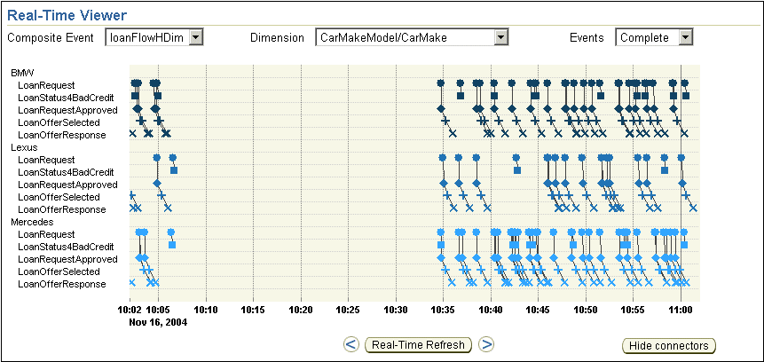
Figure 4-9 Real-Time Viewer Displaying Pending Composite Events Only
The left arrow and right arrow under the chart allow you to scroll back and forth through the chart data. Click the left arrow, to scroll back one increment of time. Click the left arrow several times to scroll back additional increments of time. The time increment is one-half of the time unit you selected at the top of the page, as described in "Specifying the Window of Time to Display". Similarly, click the right arrow, to scroll forward a unit of time.
To refresh the chart data and resume the presentation of data for the current time window, click Real-Time Refresh. By default, the chart is refreshed automatically every minute.
The View Mode is specified as Real-Time when you are viewing the current time window; it is specified as historical when you are viewing any other time window.
In addition to specifying which composite events are included, you can specify whether or not connectors between related events within a composite event instance are connected. Click Hide connectors to hide the connectors; click Show connectors to show the connectors.
Figure 4-10 shows the Real-Time Viewer with the connectors hidden. Figure 4-8 shows the Real-Time Viewer with the connectors displayed.
When the events within a composite event occur within a relatively short time period, it can be useful to include the connectors between events. When the events within a composite event occur over a long period of time, days for instance, then the connectors will probably be of little value, and you might want to hide them.
Figure 4-10 Composite Event Instances with Hide Connectors Selected
To view the chart data in a tabular format, click View Event Data. A page opens with a table such as that shown in Figure 4-11, which presents the dimension name, if applicable, the time at which the event occurred, the type of event, and the eyeglass icon, which is a link to access composite event details.
See "Accessing Composite Event Details from the Chart or Event Data Table" for information about displaying composite event details.
You can access composite event details from both the chart and the Event Data table, as follows:
In the chart, click a data point within the chart.
In the Event Data table, click an Event Type name or the eyeglass icon.
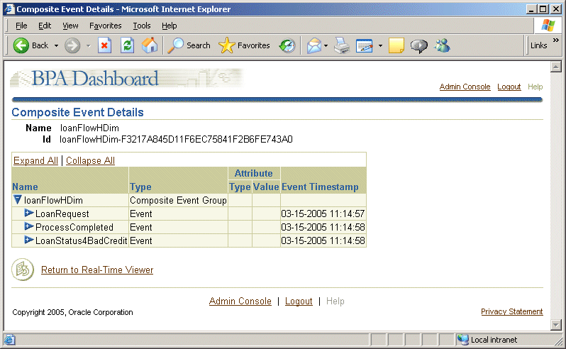
In all cases, the Composite Event Details page opens. However, when you click a data point in the chart or an Event Type name in the Event Data table, the Composite Event Details page opens with the navigation tree expanded to display the attributes of the selected event type, as shown in Figure 4-12. When you click the eyeglass icon, the Composite Event Details page opens with the navigation tree collapsed, as shown in Figure 4-13.
The Composite Event Details page presents the composite event in a navigation tree. You can expand the navigation tree to view the events and the attributes of the events within the named composite event. For each event, the time at which the event occurred is presented. For each event attribute, the attribute type and value are presented.
Figure 4-12 Sample Composite Event Details Page - Navigation Tree Expanded
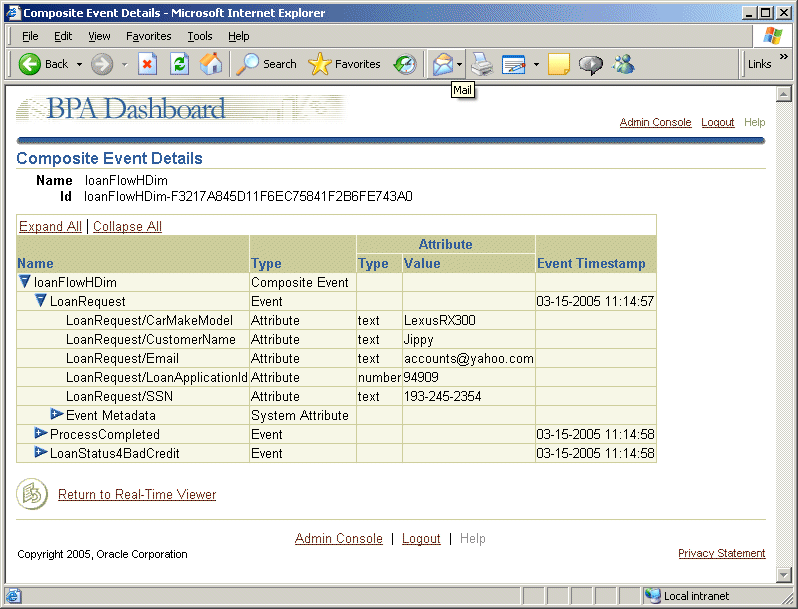
Figure 4-13 Composite Event Details - Navigation Tree Collapsed
The table that appears at the bottom of the Real-Time Viewer page displays statistics about the composite event instances in aggregate. Figure 4-14 shows a sample of this table.
Figure 4-14 Sample Table of Composite Event Instance Aggregate Values

This table presents seven columns of data for each event in a composite event. The following list describes the meaning of each column:
Event Name – Specifies the name of an event within the composite event.
Duration – Specifies the average time between the named event and the previous event in the process captured by the composite event. In the example shown in Figure 4-14, the time between a LoanOfferSelected event and a LoanOfferResponse event is the longest, on average.
Last Pending – Specifies the last event received for all pending composite event instances. A pending composite event is defined as one for which an end event has not yet been received, but which has not timed out. End events will never have a last pending value. In the example shown in Figure 4-14:
Two composite event instances have returned the LoanStatus4BadCredit event and are awaiting the next event in the process.
Two composite event instances have returned the LoanRequestApproved event and are awaiting the next event in the process.
Two composite event instances have returned the LoanOfferSelected event and are awaiting the next event in the process.
No events are considered last pending for the LoanOfferResponse event, as expected, because it is an end event.
Completed – Specifies the number of instances of the specified event that have occurred for all completed composite event instances, where a completed composite event instance is defined as one for which an end event has been received. In the example shown in Figure 4-14, of all completed composite event instances:
201 included a LoanRequest event instance
42 included a LoanStatus4BadCredit event instance
157 included a LoanRequestApproved event instance
159 included a LoanOfferSelected event instance
160 included a LoanOfferResponse event instance
Last Completed – Indicates which events were end events for all of the completed composite events. In the example shown in Figure 4-14, 42 composite event instances had an end event of LoanStatus4BadCredit, and 160 composite event instances had an end event of LoanOfferResponse.
Last Timed Out – Specifies the count of event instances that were the last received before a composite event instance timed out. In the example shown in Figure 4-14, no composite events had timed out during the time window represented in the table. This column can be useful with helping to determine where a problem is occurring. If one event has a high last timed-out value, it indicates that there is a problem getting from this event in the process to the next event and probably warrants further investigation.
All – Indicates the total number of instances of the specified event received, including completed and pending composite events. In the example shown in Figure 4-14, for all complete and pending composite event instances:
205 LoanRequest event instances have been received.
44 LoanStatus4BadCredit event instances have been received.
161 LoanRequestApproved event instances have been received.
161 LoanOfferSelected event instances have been received.
160 LoanOfferResponse event instances have been received.
Charts and tables representing values for metrics and KPIs are presented in multiple pane views. The following topics describe how to access multiple pane views and understand the charts and tables presented in them:
Metric multiple pane views, designed by the Oracle BPEL Process Analytics administrator when configuring the Dashboard (or as configured by default, in the case of the Default Metric View Pane), can contain any number and any combination of metric tables, metric charts, and an Alert View table.
To access a metric multiple pane view:
In the Switch View box, select the desired metric multiple pane view.
A page opens, typically with several charts, tables, or a combination of the two.
Specify the window of time that you want the charts in the multiple pane view to present by selecting a time from the Switch Time box. Choices range from 5 minutes to 24 hours.
The Refresh button enables you to refresh the multiple pane view on demand; by default, a multiple pane view refreshes automatically, every 2 minutes.
Other than specifying the time window to include in the charts and tables, you cannot change the content of multiple pane views – the type of chart or table, the colors used in the chart, and so on are determined by the administrator when configuring the Dashboard.
The following topics provide more information about using and understanding the tables and charts that can be presented in a metric multiple pane view:
KPI multiple pane views, designed by the Oracle BPEL Process Analytics administrator when configuring the Dashboard (or configured by default, in the case of the Default KPI View Pane), can contain any number and any combination of KPI tables, KPI charts, and an Alert View table. Figure 4-2 shows a sample KPI multiple pane view.
To access a KPI multiple pane view:
In the Switch View box, select the desired KPI multiple pane view.
A page opens, typically with several charts, tables, or a combination of the two.
Specify the window of time that you want the charts in the multiple pane view to present by clicking one of the four time values at the top of the page. Choices are: Year, Quarter, Month, and Day.
The Refresh button enables you to refresh the multiple pane view on demand; by default, a multiple pane view refreshes automatically, every 2 minutes.
Other than specifying the time window to include in the charts and tables, you cannot change the content of multiple pane views – the type of chart or table, the colors used in the chart, and so on are determined by the administrator when configuring the Dashboard.
The following topics provide more information about using and understanding the tables and charts that can be presented in a KPI multiple pane view:
Accessing the Real-Time Viewer for a KPI Presented in a View Pane
Viewing and Understanding Cause/Effect Tables – Performing Root-Cause Analysis
A radar chart displays KPI values in relation to their performance bands. Performance bands are defined by the Oracle BPEL Process Analytics administrator. A radar chart can display either multiple KPIs or multiple dimensions of one KPI.
When performance bands are defined, they allow a KPI to be divided into discrete bands to categorize performance. Oracle BPEL Process Analytics supports five performance bands, based on five performance categories relative to a target value. (For example, the default categories for performance bands are 0 - 20%, 20% - 40%, 40% - 60%, 60% - 80%, and 80% - 100%). These bands are also referred to as weak, under, normal, over, and strong performers, respectively.
Reading a radar chart is best explained using an example. Figure 4-15 shows a sample radar char. This figure presents the sales performance of five KPIs over 2 days. A blue polygon represents KPI performance relative to target values on March 16th and a green polygon represents KPI performance relative to target values on March 17th. The radar chart shows:
AvgLoanAPR was a normal performer on both days.
CountLoanOffers was a strong performer on the 16th, but an under performer on the 17th.
CountLoanOffers4BadCredit was a strong performer on the 16th, but an under performer on the 17th.
CountReq was a strong performer on the 16th, but an under performer on the 17th
CountReqReject was a strong performer on the 16th, but a normal performer on the 17th.
As shown in Figure 4-15, due to limited space, KPI labels can be cropped. To view the full KPI name, place the mouse cursor over the KPI label; a pop-up window displays the full KPI name. Also note that radar charts are optimally displayed when the target screen size is set to 800 x 600 pixels. At other sizes, the radar chart appears off-center. The Oracle BPEL Process Analytics administrator can reset the target screen size, as described in "Setting the Dashboard Screen Size".
To drill down in the radar chart and view KPI detail pages, click a KPI (or KPI dimension) label within the chart.
After viewing a KPI in a view pane, you may decide you want to see the real-time delivery of the event instances within the composite event on which the KPI is defined.
To access the Real-Time Viewer from a multiple pane view, click the Real-Time Viewer icon (shown in Figure 4-4) that appears in the upper-right corner of the KPI view pane for which you want to view events.
If a multiple pane view contains data from multiple composite events, then multiple Real-Time Viewer icons will be presented. Moving the cursor over any one of the Real-Time Viewer icons causes a pop-up window to open and display the composite event that will be displayed in the Real-Time Viewer if you click that icon.
KPI detail pages enable you to analyze, in depth, a KPI presented in a multiple pane view. Four KPI detail pages are available, as described in the Table 4-1.
Table 4-1 Summary of KPI Detail Pages
| Page Name | Description | Detailed Information |
|---|---|---|
| Performance | Presents KPI details over a selected time period. If target values for the selected KPI have been specified, they are included in the presentation. | Viewing and Understanding Performance Details
|
| Cause/Effect | Presents the KPIs that influence the selected KPI and the KPIs that the selected KPI influences. Useful for root-cause analysis. | Viewing and Understanding Cause/Effect Tables – Performing Root-Cause Analysis
|
| Information | Presents a table of links to documents that provide information relevant to the selected KPI. | Viewing and Understanding KPI Context Documents
|
| Prediction | Presents a prediction for the selected KPI value. | Viewing and Understanding KPI Predictions
|
The Performance Detail page presents KPI performance data over time. If the administrator has specified target values for a KPI, the target values are also presented, so that you can compare the actual performance values to the target performance values.
To access performance details:
In the Dashboard, select a multiple pane view from the View box.
In the multiple pane view, click a data point in any chart or table. A Performance Detail page opens.
In the Switch KPI box, select the KPI for which you want to view performance. The Performance Detail page opens for the selected KPI.
Controls in the Performance Detail page allow you to specify the dimensions by which KPIs are filtered, the specific dimension values to present, the type of chart in which to present the data, and how far back from the current time you want the chart to include data. As with charts in multiple pane views, you can determine the exact value of an element in a chart presented in the Performance Detail page by placing the mouse cursor over the chart element of interest.
Table 4-2 describes the available controls.
Table 4-2 Performance Detail Page Controls
The following figures provide some examples of the different choices you can make with controls in the Performance Detail page:
Figure 4-16 displays CountLoanOffers KPIs in a line chart over a period of days. KPIs are not broken down by dimension. Figure 4-17 displays the same data, along the ProviderName dimension
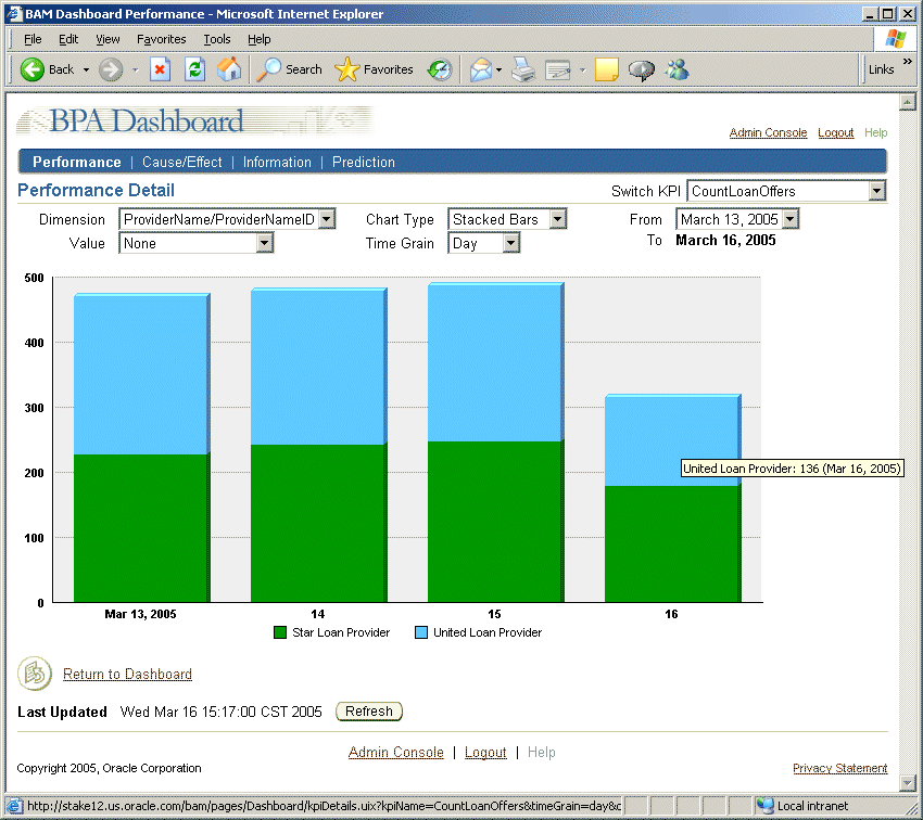
Figure 4-18 displays the CountLoanOffers KPIs for the ProviderName dimension and both dimension values (Star Loan Provider and United Loan Provider) in a clustered bar chart over a period of days. Figure 4-19 displays the same data, in a stacked bar chart.
Figure 4-16 Sample Performance Detail Page: Line Chart, All Dimensions
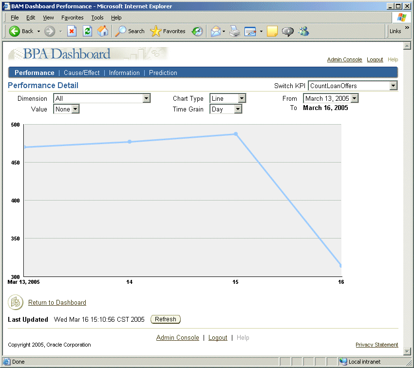
Figure 4-17 Sample Performance Detail Page: Line Chart, Selected Dimension
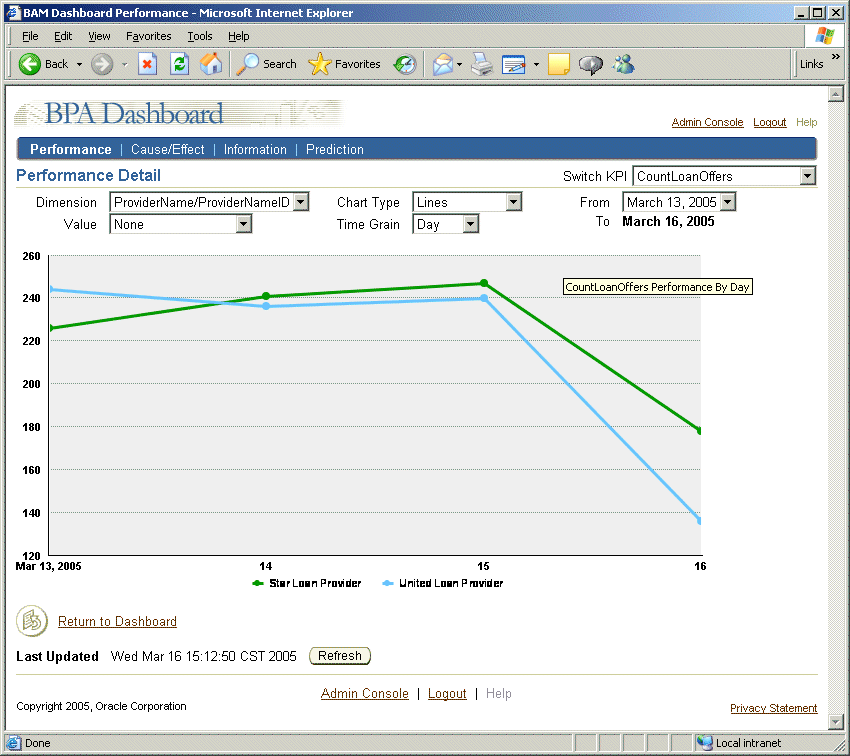
Figure 4-18 Sample Performance Detail Page: Clustered Bar Chart, Selected Dimension
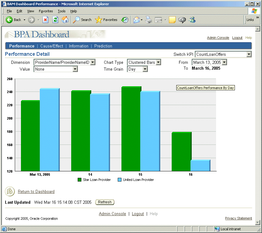
Figure 4-19 Sample Performance Detail Page: Stacked Bar Chart, Selected Dimension
In addition to using the controls to view data along different dimensions, when hierarchical dimensions are defined, you can drill down in the dimension by clicking data points in the chart. A hierarchical dimension is one that uses ordered levels as a means of organizing data. For example, in a time dimension, the hierarchy organizes data at the year level (hierarchy 1), the month level (hierarchy 2), or the day level (hierarchy 3).
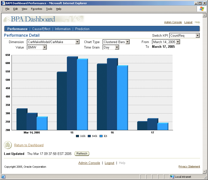
Figure 4-20 shows the data presented along the CarMake dimension – a hierarchy 1 dimension. Figure 4-21 shows the result when you click a bar representing the BMW make; all of the BMW models are presented.
Figure 4-20 Data Presented Along Hierarchy One Dimension
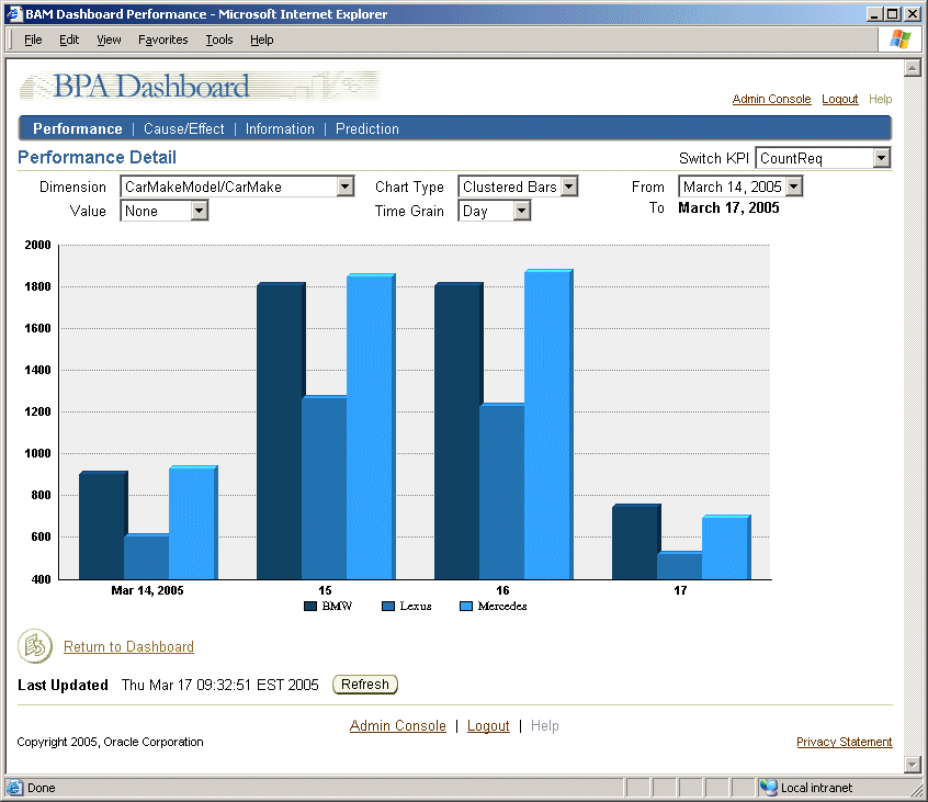
Figure 4-21 Data Presented Along Hierarchy Two Dimension
A Cause/Effect table is one of a number of tables and charts that can be configured by the administrator to include in the Dashboard. A Cause/Effect table is useful for performing root-cause analysis of a KPI value.
There are two forms of the Cause/Effect table: a full form of the table, presented in a KPI detail page; and an abbreviated form, which is presented when a Cause/Effect table is included in a multiple pane view.
To access a full form Cause/Effect table:
In the Dashboard, select a multiple pane view from the Switch View box.
In the multiple pane view, click a data point in any chart or table. A Performance Detail page opens.
Click Cause/Effect.
In the Switch KPI box, select the KPI for which you want to view cause and effect details.
In the Analysis Time Grain box, select the unit of time (day, month, quarter, year) over which you want Cause/Effect details presented.
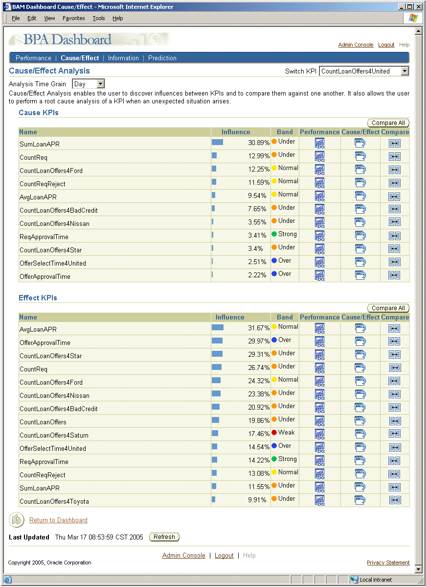
Figure 4-22 shows an example of the full form of a Cause/Effect table. (The abbreviated form excludes the Performance, Cause/Effect, and Compare columns.)
A Cause/Effect table shows the following, in relation to a selected KPI:
Cause KPIs – Each of the KPIs that influence the selected KPI's value, the amount of influence each Cause KPI has on that selected KPI, and the KPI performance band value for the Cause KPI are presented. In Figure 4-22, for example, the SumLoanAPR value has an influence of 30.89% on the CountLoanOffers4United KPI value. The SumLoanAPR KPI is under performing for the day (as indicated by the Band column).
Effect KPIs – Each of the KPIs on which the selected KPI has an influence, the amount of influence the selected KPI has on each of the Effect KPIs, and the KPI performance band value for the Effect KPI are presented. In Figure 4-22, for example, the SumLoanAPR KPI's performance has an influence of 31.67% on the AvgLoanAPR KPI's performance. The AvgLoanAPR KPI is a normal performer for the day (as indicated by the Band column)
In addition, in the full form of the table, the Performance, Cause/Effect, and Compare columns provide links to detail pages about each of the KPIs presented in the table, as follows:
Performance
Provides a link to the KPI Performance detail page for the associated Cause or Effect KPI. If the Band column indicates that the KPI performance is other than expected, you might click this link to see how that particular KPI has been performing, particularly if it has a strong influence on the selected KPI or is strongly affected by the selected KPI.
See "Viewing and Understanding Performance Details" for more information.
Cause/Effect
Provides a link to the KPI Cause/Effect detail page for the associated Cause or Effect KPI. If the Band column indicates that the KPI performance is other than expected, you might click this link to see what is influencing this Cause or Effect KPI and what other KPIs this Cause or Effect KPI is affecting.
Compare
Provides a link to a page that presents the selected KPI and the Cause KPI in bar charts for easy visual comparison. Clicking the Compare All button displays all of the KPIs accessible to the user in bar charts.
Figure 4-23 shows an example of the page that opens when you click a Compare icon. The page that is presented when you click the Compare All button is similar, but includes a chart for each of the Cause or Effect KPIs.
Figure 4-22 Cause/Effect Table in KPI Detail Page
You can view a list of documents related to the KPI you select, assuming the administrator configured them, in the Information Documents page. Documents are listed in order of their weighted value. The weighted value indicates how likely the document will contain information of interest to you.
To access KPI context documents:
In the Dashboard, from the Switch View box, select a multiple pane view.
In the multiple pane view, click a data point in any chart or table. A Performance Detail page opens.
In the Switch KPI box, select the KPI for which you want to view KPI context documents. The Performance Detail page opens for the selected KPI.
Click Information. The Information Documents page opens and displays the list of information documents and their weighted values, as shown in Figure 4-24.
The Dashboard Prediction Details page provides a prediction for a selected KPI value, based on related KPI values.
In the Dashboard, select a multiple pane view from the Switch View box.
In the multiple pane view, click a data point in any chart or table. A Performance Detail page opens.
Click Prediction.
In the Switch KPI box, select the KPI for which you want to view a prediction. The Prediction Detail page opens for the selected KPI.
In the Analysis Time Grain box, select the unit of time (day, month, quarter, year) over which you want Prediction details presented.
Figure 4-25 shows a sample Prediction Details page.
The Prediction Detail page identifies the selected KPI for which prediction details are being presented (in Figure 4-25, CountReq), and a table of KPIs that Oracle BPEL Process Analytics used in calculating the prediction. These KPIs are referred to as source KPIs.
The prediction details for the selected KPI, include the following information:
The predicted value for the current time grain. In Figure 4-25, the time grain is the current day.
Oracle BPEL Process Analytics arrives at the predicted value for the selected KPI by determining the sum of all of the predicting KPIs' predicted values, each weighted by its confidence value. Using the values in this example, the equation would be:
(4715 x (9/(9+35))) + (4680 x (35/(9+35)))= 4687
The target value, if a target value was specified. For the KPI in Figure 4-25, a target value of 290 was specified.
The target value is set by the Oracle BPEL Process Analytics administrator.
The confidence level in the predicted KPI value, if a target value was specified. For the KPI in Figure 4-25, the confidence level is 31%.
The confidence level is the average of the source KPIs' confidence values.
The performance band in which the predicted value falls.
Oracle BPEL Process Analytics determines the set of source KPIs to use to form the prediction based on how closely they are correlated with the KPI for which a prediction is being made. If the absolute value of the correlation of the KPI being predicted and another KPI is .8, then that KPI is included in the set of source KPIs.
The values for each of the source KPIs are determined, as follows:
The predicted value for each source KPI is determined by simple linear regression of its previous values.
The correlation factor for each source KPI is a number between -1 and 1, as determined by standard statistical equations. It indicates how a source KPI affects the selected KPI.
The confidence level for each source KPI is its correlation factor squared.
You can determine the exact value for an element in a chart by placing the mouse cursor over the data of interest. In Figure 4-26, for example, a pop-up window displays the exact value, BMWX5: 89 (11.77%), represented by the portion of the pie chart that is presenting loan requests for the BMWX5.
A metric table view of a data series, such as shown in Figure 4-27, presents metric values as they are generated, in real-time. Over time, this table can contain too many rows to present on a single page. Therefore, the table is limited to 10 rows, with Next and Previous buttons provided to allow you to scroll through the additional data. When you click the Next button, updates to the table are suspended until you click Resume Updates.
Data is presented in this table in real-time, over the time window you select from the Switch Time box. Suspending updates allows you to scroll back and forth among a given set of data until you are ready to see the next set of data. Otherwise, for example, suppose you were scrolling through the data. The first set of rows you viewed could be cleared from the table by the time you clicked the Previous button to return to that set of data. By suspending updates, Oracle BPEL Process Analytics prevents this from happening.
Both KPI and Metric multiple pane views can include an Alert View table if the administrator chose to include it. The Alert View table specifies the alert name, alert type, and the time at which the alert was sent, as shown in Figure 4-28.
Click a value in the Alert Name column to view details about that alert. Figure 4-29 shows a sample Alert Detail page. Note that the list of values presented in the Alert Detail page may vary, depending on how the alert was defined and whether it is a KPI or metric alert.
The information in this page is described in the following table:
| Page Element | Description |
|---|---|
| Owner | The account name of the user to whom the alert belongs. |
| Expression | The expression that describes the condition under which the alert is triggered. |
| Description | If specified, the description entered by the administrator when the trigger was defined. |
| Trigger Time | The time at which the alert was triggered. |
| Notification Time | The time at which the notification was sent, if a notification channel (also referred to as a delivery channel) was specified when the alert was defined. |
| Delivery Channel | The method (such as e-mail, phone, fax, and so on) by which a notification was sent, if a delivery channel was specified. |
| Time Grain | The frequency at which the alert will be fired. For example, if the time grain is Day, then it will fire once per day. This property applies to KPI alerts only. |
| Next Notification Time | The earliest time at which the next notification will be sent. This property applies to KPI alerts only. |
| Action | The URL of the Web service that is invoked when the alert is triggered. |
| Action Request | The URL of the Web service payload. (If the Web service takes an argument, this would be the URL for the .xml file containing the argument value.)
|
| Action Response | The response from the Web service. A long Web service response may be truncated. If it is truncated, then the truncated text appears as a link. Click the link to view the full text. |
| Associated KPI or Metric | For a KPI alert, the name and value of the KPI that triggered the alert are presented as well as an icon that provides a link to the KPI Performance Detail page, such as shown in Figure 4-16.
For a metric alert, the name of the metric that triggered the alert are presented, as well as the underlying composite event. The composite event is presented as a link. When you click the composite event name, the Composite Event Details page opens, such as shown in Figure 4-12. |