|
Oracle® Application Server Portal User’s Guide
10g (9.0.4) Part No. B10358-01 |
|
|
|
|
Oracle® Application Server Portal User’s Guide
10g (9.0.4) Part No. B10358-01 |
|
|
|
|
This appendix lists the seeded portal objects (for example, item types and portlets) that OracleAS Portal provides to help get you started with creating your portal. It contains the following main sections:
During installation, OracleAS Portal creates some page groups that it needs to accomplish certain tasks. For example, the Portlet Repository, which contains all the portlets from local and remote providers that can be added to pages, is simply a page group. You cannot delete these default page groups. For information about creating your own page groups, see Section 4.1, "Creating a Page Group".
Table B-1 lists the built-in page groups and explains how they are used:
Table B-1 Built-in Page Groups
The following attributes are included in OracleAS Portal by default. For information about creating your own attributes, see Section 5.2.1, "Working with Attributes".
Table B-2 lists the base attributes that can be used to store information about an item or page. For information about how to add these attributes to page and item types, see Section 5.2.2.2, "Editing a Page Type" and Section 5.2.3.2, "Editing an Item Type".
Table B-2 Base Content Attributes
Table B-3 lists the base attributes that can be used to display information about an item or portlet. For information about how to display these attributes on a page, see Section 7.5.2.10, "Changing the Attributes Displayed in a Region".
Table B-3 Base Display Attributes
| Attribute: | Displays: |
|---|---|
| Associated Functions | Links to functions associated with the item if the item is of a custom type that includes function calls. |
| Author | The name of the author of the item. |
| Category | The name of the category to which the item or portlet belongs. |
| Create Date | The date when the item or portlet was added to the page. |
| Creator | The user name of the user who added the item or portlet to the page. |
| Date Updated | The date when the item or portlet was last updated. |
| Description | The short text description of the item or portlet. |
| Display Name | The display name of the item or portlet. |
| Display Name Link | The display name of the item or portlet as a link pointing to the item or portlet content.
Note: The display name will not be a link if the Displayed Directly In Page Area display option is selected for the item or portlet. |
| Display Name And Image | The display name and image of the item or portlet as links pointing to the item or portlet content. If the item has both a display name and an image, these will appear next to each other. If the item does not have an associated image, only the display name will appear.
Notes:
|
| Document Size | The size of the uploaded file.
Note: This attribute applies only to File and Simple File items, or items of a type based on the Simple File item type. |
| Expire Date | The date (in the format, DD-MON-YYYY HH12:MI PM) when the item is due to expire. |
| Gist | The Gist icon. Users can click this icon to display an overview of the item created by Oracle Text.
Note: This attribute displays only if Oracle Text is enabled and only for File and Simple Files items, or items of a type based on the Simple File item. |
| Help URL | The Help icon. Users can click this icon to display help for the portlet.
Note: This attribute is appropriate only for Portlet Repository pages, and displays only if the portlet developer specified a help URL for the portlet. |
| Image | The image associated with the item. If the item does not have an associated image, nothing is displayed. |
| Image Link | The image associated with the item as a link pointing to the item content. If the item does not have an associated image, nothing is displayed.
Note: This image will not be a link if the Item Displayed Directly In Page Area display options is selected for the item. |
| Image or Display Name Link | The image associated with the item as a link pointing to the item content. If the item does not have an associated image, the display name is displayed instead.
Note: The image or display name will not be links if the Item Displayed Directly In Page Area display option is selected for the item. |
| Image URL | The image icon. Users can click this icon to display a preview of the portlet.
Note: This attribute is appropriate only for Portlet Repository pages, and displays only if the portlet developer specified a preview image URL for the portlet. |
| Item Content | The content of the item if the Item Displayed Directly In Page Area display option is selected.
Note: This attribute displays only for Text, Simple Text, and Simple PL/SQL items, or items of a type based on the Simple Text or Simple PL/SQL item types. |
| Keywords | The keywords associated with the item or portlet. |
| Last Updated By | The user name of the user who last updated the item or portlet. |
| Mime Type Image | The image associated with the MIME type of the uploaded file.
Note: This attribute displays only for File and Simple File items, or items of a type based on the Simple File item type. |
| New Item Indicator | The New icon. Users can click this icon to display a list of all the new content in the page group.
Note: An item or portlet is considered new for the number of days specified in the page group Icon Display Period setting. See Section 5.6.4, "Displaying the New and Updated Icons". The display period applies to both the New and Recently Updated icons. You cannot set a different display period for the individual icons. |
| Perspectives | The names of the perspectives associated with the item or portlet. |
| Portlet Content | The portlet itself if the Item Displayed Directly In Page Area display options is selected. |
| Portlet Id | The id of the portlet.
Note: This attribute is appropriate only for Portlet Repository pages. |
| Portlet Name | The name of the portlet. |
| Property Sheet | The Property Sheet icon. Users can click this icon to view the properties of an item or portlet. |
| Provider Id | The id of the provider.
Note: This attributes is appropriate only for Portlet Repository pages. |
| Provider Name | The name of the provider.
Note: This attribute is appropriate only for Portlet Repository pages. |
| Publish Date | The date when the item is published on the page (i.e., when the item is visible to users in View mode). |
| Score | The Oracle Text relevancy score, rating how each result matches the search words. |
| Subscribe | The Subscribe or Unsubscribe icon. Users can click the Subscribe icon to subscribe to an item and be notified, via the Notification portlet, when it is updated. Users can click the Unsubscribe icon to unsubscribe from an item to which they had previously subscribed.
Note: The Subscribe icon only appears if approvals and notifications have been enabled for the page group. |
| Themes | The Themes icon. Users can click this icon to display the nouns and verbs appearing most often within an item.
Note: This attribute displays only if Oracle Text is enabled and only for File and Simple File items, or items of a type based on the Simple File item type. |
| Translations | A list of the languages in which the item or portlet is available. |
| Updated Item Indicator | The Recently Updated icon. Users can click this icon to display a list of all the recently updated content in the page group.
Note: An item or portlet is consider recently updated for the number of days specified in the page group Icon Display Period setting. See Section 5.6.4, "Displaying the New and Updated Icons". The display period applies to both the New and Recently Updated icons. You cannot set a different display period for the individual icons. |
| Versions | The Versions icon. Users can click this icon to view other versions of the item.
Note: This attribute displays only for items that have multiple versions. |
| View As HTML | The View As HTML icon. Users can click this icon to view an HTML version of an item.
Note: This attribute displays only if Oracle Text is enabled and only for File and Simple Files items, or items of a type based on the Simple File item type. |
| View As HTML With Highlight | The View AS HTML With Highlight icon. Users can click this icon to view an HTML version of an item with search terms highlighted.
Note: This attribute displays only if Oracle Text is enabled and only for File and Simple File items, or items of a type based on the Simple File item type. Additionally, this attribute display only on search results pages. |
Table B-4 lists the page types that are included in OracleAS Portal by default. For information about creating your own page types, see Section 5.2.2, "Working with Page Types".
Table B-4 Base Page Types
Table B-5 and Table B-6 list the base item types that are included in OracleAS Portal by default. Table B-7 lists the built-in custom item types. For information about extending these item types to meet your requirements, see Section 5.2.3.2, "Editing an Item Type". For information about how to create your own item types, see Section 5.2.3, "Working With Item Types".
Table B-5 Base Content Item Types
Table B-6 Base Navigation Item Types
Table B-7 Built-in Custom Item Types
OracleAS Portal provides many portlets to get you started with building your portal. The following table lists the portlets that OracleAS Portal provides by default and where they can be found in the Portlet Repository.
|
Note: If the portal administrator has reorganized the Portlet Repository, these built-in portlets may be in different locations within the Portlet Repository. |
You can find many more portlets in the OracleAS Portal Portal Catalog. The Catalog includes portlets and services offered by our OracleAS Portal Partners, and you can see the full list of partners and get a brief description of their offerings at http://portalcatalog.oracle.com.
Table B-8 Built-in Portlets in the Portlet Builders Page of the Portlet Repository
Table B-9 Built-in Portlets in the Survey Builder Page of the Portlet Repository
| Portlet | Description |
|---|---|
| Survey Builder | Create, edit, or copy questions, score text (essay) responses, purge responses, or delete a survey, test, or poll. See Section B.5.7, "Working with the Survey Portlets" |
| Survey Form | Display a survey, test, or poll. See Section B.5.7, "Working with the Survey Portlets" |
| Survey Chart | Display the cumulative results of a survey, test, or poll in a bar chart format. Drill down for individual participant results. See Section B.5.7, "Working with the Survey Portlets" |
| Survey Report | Display the cumulative results of a survey, test, or poll in a report format. Drill down for individual participant results. See Section B.5.7, "Working with the Survey Portlets" |
Table B-10 Built-in Portlets in the Additional Portlet Builders Page of the Portlet Repository
Table B-11 Built-in Portlets in the Portal Content Tools Page of the Portlet Repository
| Portlet | Description |
|---|---|
| Favorites | List links to your favorite Web pages. See Section B.5.1, "Working with the Favorites Portlet". |
| Advanced Search | Perform an advanced search within page groups. |
| Basic Search | Perform a basic search within page groups. |
| Custom Search | Create a custom search that exposes attributes, search criteria and parameters, and so on. |
| My Approval Status | List the status of items awaiting approval. |
| My Notifications | List notifications about approvals, expirations, and subscriptions. |
| My Page | Display your personal page
Note: This portlet is available only if you have a personal page, or you are the portal administrator or the Shared Objects page group administrator. |
| Pending Approvals Monitor | List items awaiting approval. |
| Saved Searches | List your saved searches. |
| User Managed Pages | List the pages on which you have the Manage privilege. |
| Set Language | Set the language for the portal. See Section B.5.5, "Working with the Set Language Portlet". |
The Published Portal Content page of the Portlet Repository contains portlets published from the default page groups.
The Shared Instances page of the Portlet Repository is where a portlet appears if it has been shared.
Table B-12 Built-in Portlets in the Portal Community News Page of the Portlet Repository
| Portlet | Description |
|---|---|
| Product News | Display news about OracleAS Portal. See Section B.5.6, "Working with the OracleAS Portal Community Portlets". |
| Developer News | Display technical news about OracleAS Portal. See Section B.5.6, "Working with the OracleAS Portal Community Portlets". |
| OracleAS Portal Community | List links to the OracleAS Portal community. See Section B.5.6, "Working with the OracleAS Portal Community Portlets". |
| Documentation News | Display news about OracleAS Portal documentation. See Section B.5.6, "Working with the OracleAS Portal Community Portlets". |
Table B-13 Built-in Portlets in the SSO/OID Page of the Portlet Repository
| Portlet | Description |
|---|---|
| External Applications | List links to your external applications. See Section B.5.3, "Working with the External Applications Portlet". |
| Login | Log on directly from a page. See Section B.5.4, "Working with the Login Portlet". |
| SSO Server Administration | Administer users, configure partner and external applications for authentication through the Oracle Application Server Single Sign-On Server, and edit the Oracle Application Server Single Sign-On Server configuration. |
| User | Create or edit users. |
| Group | Create or edit groups of users. |
| People Search | Search for a user. |
| Portal Group Profile | Edit a group’s portal preferences and global privileges. |
| Portal User Profile | Edit a user’s portal preferences and global privileges. |
Table B-14 Built-in Portlets in the Database Page of the Portlet Repository
Table B-15 Built-in Portlets in the Portal Page of the Portlet Repository
| Portlet | Description |
|---|---|
| Services | Edit portal settings |
| Export/Import Transport Set | Edit transport sets for exporting, import transport sets, and view information about existing transport sets. |
| Clear Cache | Clear the cache. |
| Database Providers | Create, edit, or navigate to a Portal database provider. |
| Error Message Portlet | List diagnostic information for error messages. |
| Find | Search page groups, Portal database providers, and database objects. |
| Mobile log by portlet | List the headers and content of the mobile-enabled portlets, and the results of an Oracle Application Server Wireless XML syntax check on the content of those portlets.
Note: This portlet is intended for use by mobile portlet developers to test their portlets. |
| Most recent mobile log entry | List the headers and content of the most recently accessed mobile-enabled portlet, and the results of an Oracle Application Server Wireless XML syntax check on the content of that portlet.
Note: This portlet is intended for use by mobile portlet developers to test their portlets. |
| Page Group Navigator | Navigate page groups.
Note: The Navigator portlets are specifically designed for use on the Navigator pages. If you add them to pages outside of the Navigator, you may get unexpected behavior. Therefore, we recommend that you avoid placing the Navigator portlets on pages outside of the Navigator. |
| Page Groups | Create, edit, or navigate to a page group; create or edit a page; create a style or page template. |
| Portlet Repository | Display the Portlet Repository, refresh all the portlets in the Portlet Repository, or view the refresh log. |
| Providers Navigator | Navigate providers, including Portal database providers and their portlets.
Note: The Navigator portlets are specifically designed for use on the Navigator pages. If you add them to pages outside of the Navigator, you may get unexpected behavior. Therefore, we recommend that you avoid placing the Navigator portlets on pages outside of the Navigator. |
| Recent Objects | List the objects recently modified by you. See Section B.5.2, "Working with the Recent Objects Portlet". |
| Remote Provider Group | Create, edit, or refresh provider groups. |
| Remote Providers | Create, edit, or refresh provider information. |
Table B-16 Built-in Portlets in the Oracle Reports Security Page of the Portlet Repository
The Samples page of the Portlet Repository does not contain any default portlets.
The Portlet Staging Area page of the Portlet Repository is where the portlets appear when a provider is first registered with the portal. The portal administrator can edit the Portlet Repository to move these portlets to a more suitable location.
The Favorites portlet allows users to quickly access their most often used and favorite Web pages.
You can add, edit, delete, and move favorites in the Favorites portlet. You can also create default favorites for all users of the portlet. Additionally, you can customize the portlet to control how the favorites and favorite groups are displayed.
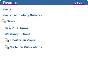
A favorites group is a collection of favorites and groups that are usually logically related. For example, you might create a favorites group called Newspapers that contains links to The New York Times, The Washington Post, and so on. The favorite group might also contain other favorite groups called Michigan Publications and Libertarian Press, which contain favorites to URLs related to those themes.
Favorite groups are displayed in the Favorites portlet only if you select the Hierarchical display method on the Edit Favorites Portlet Settings page. Favorite groups are designated by the Favorite Group icon:
Figure B-1 The Favorites Portlet in Hierarchy Display Mode
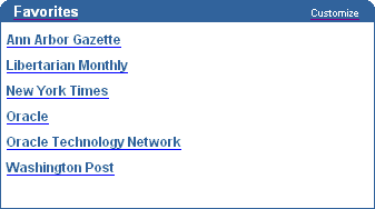
If you select the Flat List display method, favorites are shown without the group to which they belong:
Figure B-2 The Favorites Portlet in Flat List Display Mode
To add links to your favorite Web pages, you customize the Favorites portlet. You can also customize the Favorites portlet to:
Change the name of the portlet (for example, from Favorites to Sarah’s Sites).
Choose to display the favorites by group or as a flat list.
Choose to display the default favorites as well as your own favorites.
Choose to display the favorites in a new browser window.
Control how many favorites are displayed in the portlet.
|
Note: When you customize the Favorites portlet, the changes that you make are visible only to yourself. |
To customize the Favorites portlet settings:
In the Favorites portlet header, click the Customize link.
In the Display Name field, enter a descriptive display name for the Favorites portlet. The display name is displayed in the Favorites portlet header.
In the Structure list, choose Hierarchy to display your favorite groups, as well as the favorites within them. You can nest your groups to two levels within the portlet, not including the root level. Choose Flat to remove group names from the portlet and display all the favorites in a list.
Select the Display Default Favorites check box to include the default favorites in the portlet, as well as your own favorites.
Select the Open Favorites In New Browser Window check box to open the favorites in a new browser window.
In the Display radio group, select Show All to show all your favorites in the portlet, or select Limit List To and enter a number from 0 to 99 to control how many favorites are displayed.
Click OK.
Click Reset to Defaults to restore the Favorites portlet settings to the default settings. This does not delete your favorites from the Favorites portlet, it simply resets the portlet settings, such as the Display Name and Structure.
To add a favorite:
In the Favorites portlet header, click the Customize link.
Click the Add Or Edit Favorites link.
To add a favorite at the top level, click the Create Favorite link next to Actions. To add a favorite to a group, click the Create Favorite link next to the group.
In the Display Name field, enter a descriptive display name for the favorite. The display name is displayed as a link in the Favorites portlet.
In the URL field, enter the URL of the Web page that you are adding as a favorite.
In the Description field, enter a description for the favorite. The description is visible only when you are editing the favorite.
Click Create.
To create a favorite group:
In the Favorites portlet header, click the Customize link.
Click the Add Or Edit Favorites link.
To create a favorite group at the top level, click the Create Group link next to Actions. To create a favorite group under another group, click the Create Group link next to the group.
In the Display Name field, enter a descriptive display name for the favorite group. The display name is displayed in the Favorites portlet.
In the Description field, enter a description for the favorite group. The description is visible only when you are editing the favorite group.
Click Create.
To edit a favorite or favorite group:
In the Favorites portlet header, click the Customize link.
Click the Add Or Edit Favorites link.
Click the Edit link next to the favorite or favorite group that you want to edit.
Edit the favorite or favorite group settings as required.
Click OK.
To move a favorite or favorite group:
In the Favorites portlet header, click the Customize link.
Click the Add Or Edit Favorites link.
Click the Move link next to the favorite or favorite group that you want to move.
Click the Move To link next to the group under which you want to move the favorite or favorite group.
To delete a favorite or favorite group:
In the Favorites portlet header, click the Customize link.
Click the Add Or Edit Favorites link.
Click the Delete link next to the favorite or favorite group that you want to delete.
If you are deleting a favorite group, click Yes in the confirmation page. If you are deleting a favorite, the favorite is deleted immediately. You are not prompted for confirmation.
|
Note: When you delete a favorite group, all the favorites and favorite groups belonging to the deleted favorite group are also deleted. |
In addition to the favorites that users create themselves, page designer can create default favorites that display to all users of the Favorites portlet. Both the user added favorites and the default favorites display in the Favorites portlet.
To add a default favorite:
Edit the page that contains the Favorites portlet.
Click the Edit Defaults icon next to the Favorites portlet.
Click the Add Or Edit Default Favorites link.
To add a default favorite at the top level, click the Create Favorite link next to Actions. To add a default favorite to a group, click the Create Favorite link next to the group.
In the Display Name field, enter a descriptive display name for the default favorite. The display name is displayed as a link in the Favorites portlet.
In the URL field, enter the URL of the Web page that you are adding as the default favorite.
In the Description field, enter a description for the default favorite. The description is visible only when you are editing the default favorite.
Click Create.
To create a default favorite group:
Edit the page that contains the Favorites portlet.
Click the Edit Defaults icon next to the Favorites portlet.
Click the Add Or Edit Default Favorites link.
To create a default favorite group at the top level, click the Create Group link next to Actions. To create a default favorite group under another group, click the Create Group link next to the group.
In the Display Name field, enter a descriptive display name for the default favorite group. The display name is displayed in the Favorites portlet.
In the Description field, enter a description for the default favorite group. The description is visible only when you are editing the default favorite group.
Click Create.
The Recent Objects portlet allows users to quickly access the objects they most recently created or edited within OracleAS Portal.
You can customize the Recent Objects portlet to complete one or more of the following tasks:
Change the name of the portlet (for example, from Recent Objects to Most Used).
Control how many objects are displayed in the portlet.
Choose which object attributes to display.
To customize the Recent Objects portlet:
In the Recent Objects portlet header, click the Customize link.
In the Banner field, enter a descriptive display name for the Recent Objects portlet. The display name is displayed in the Recent Objects portlet header.
In the Display radio group, select Show All to show up to 50 objects in the portlet, or select Limit List To and enter a number from 0 to 50 to explicitly control how many objects are displayed.
Select to appropriate Display check boxes to control what appears next to the objects in the portlet. Select:
Object Type to display the type of object, such as Page or Master-Detail Form.
Object Image to display a visual representation of the object.
Numbered List to place a number in sequential order to the left of each object.
Click OK.
Click Reset to Defaults to restore the Recent Objects portlet settings to the default settings.
The External Applications portlet allows users to access applications outside of OracleAS Portal that require an HTML form-based login. For links and applications that do not require a login, a Favorites link is a better choice.
You can customize the External Applications portlet to complete one or more of the following tasks:
Change the name of the portlet.
Choose to display or hide certain applications.
Supply your user name and password for applications so that OracleAS Portal can automatically log you in.
Change the name of the application as it appears in the portlet.
To customize the External Applications portlet:
In the External Applications portlet header, click the Customize link.
In the Banner field, enter a descriptive display name for the External Applications portlet. The display name is displayed in the External Applications portlet header.
Select the appropriate Display check boxes to control which applications display in the portlet. If a check box is not selected, the associated application does not appear in the portlet.
The portal administrator determines which applications are included in this list.
If you want OracleAS Portal to automatically log you into the application whenever you launch it from the External Applications portlet, click the Edit icon to enter your user name and password for the application.
In the User Name/ID field, enter your user name for this application.
In the Password field, enter your password for this application.
If you ever change your password for this application, be sure to update your password on this page as well.
Select the Remember My Login Information For This Application check box.
Click OK.
To launch the application itself, click the link in the Application Name column. If necessary, fill in your user name and password, then click Login.
To change the name of the application as it appears in the portlet, enter the new name in the Preferred Name field.
Click OK.
Click Reset to Defaults to restore the External Applications portlet settings to the default settings. Clicking Reset to Defaults returns you to your page.
The Login portlet allows users to log in to a portal directly from a page. If the self-registration feature is enabled, the Login portlet can also include a link to allow users to register with the portal and create their own user accounts.
You can control the following aspects of the Login portlet:
The name of the portlet.
The pages to display on successful login or logout.
Whether to display the Login portlet when users are logged on.
Whether users can register themselves with the portal.
To set up the Login portlet:
Edit the page that contains the Login portlet.
Click the Edit Defaults icon next to the Login portlet.
In the Banner field, enter a descriptive display name for the Login portlet. The display name is displayed in the Login portlet header.
In the On Success URL field, enter the URL of the page to display when users successfully log on.
Leave this field blank if you want to display the same page that contains the Login portlet.
In the On Cancel URL field, enter the URL of the page to display when users log out.
Leave this field blank if you want to display the same page that contains the Login portlet.
Select the Hide Portlet check box if you do not want to display the Login portlet when users are logged on.
If you do not select this check box, the Login portlet is displayed containing a Logout link.
Select the Enable Self-Registration check box if you want to allow users to register with the portal and create their own user accounts.
In the Self-Registration Link Text field, enter the text for the self-registration link. This is the link that users click to register with the portal and create their own user accounts. The default is Create New Account.
In the Self-Registration URL field, enter the URL of the page to display when users click the self-registration link.
If you do not have your own custom self-registration page, leave this field blank to use the default self-registration page provided by OracleAS Portal.
Click OK.
The Set Language portlet allows users to set the language to use for their portal sessions. If the territory feature is enabled, users can also set their geographical location (territory) so that localization settings such as date, currency, and decimal formats are displayed correctly. If the territory feature is not enabled, the territory is defaulted to the most common for the selected language. Users in different territories may notice some of the localization settings are different from what they might expect.
You can control the following aspects of the Set Language portlet:
The name of the portlet.
How the languages are displayed in the portlet.
Whether users can also set their territory.
To set up the Set Language portlet:
Edit the page that contains the Set Language portlet.
Click the Edit Defaults icon next to the Set Language portlet.
In the Banner field, enter a descriptive display name for the Set Language portlet. The display name is displayed in the Set Language portlet header.
Select the Display Languages Vertically check box if you want the list of languages to display in a single vertical list. If you do not select this check box, the list of languages displays horizontally in several rows.
Select the Enable Territory Selection check box if you want to enable users to specify their geographical location (territory) for the portal session.
Click OK.
The OracleAS Portal Community portlets enable you to plug into the ever growing OracleAS Portal Community. Through the OracleAS Portal Community portlets, you can access useful resources on the Portal Center, such as the Developer Services with the latest Portal Developer Kit, Portal Studio, and Knowledge Exchange. You can also access resources for training, support, upgrade, discussion, and the Partner Initiative, including the Portal Catalog.
The OracleAS Portal Community portlets can also render dynamic content. To display this dynamic content, you must perform the steps below.
To display dynamic content in the OracleAS Portal Community portlets:
In the Services portlet, click the Proxy Settings link.
By default, the Services portlet is located on the Administer tab of the Builder page.
In the HTTP Proxy Host and Port fields, enter your site’s proxy server settings.
Click Add.
In the Select Proxy section, select the proxy server you just added.
Click OK.
Some of the OracleAS Portal Community portlets cache their content for a day, which means that they will not immediately change. The Developer News portlet on the Builder page is such a portlet. To immediately refresh these portlets, follow the steps below.
To refresh the OracleAS Portal Community portlets:
Edit the page that contains the portlet that you want to refresh.
Click the Edit Defaults icon next to the portlet.
In the Network Access list, make sure that on is chosen.
Click OK.
In the banner click the Refresh link.
The Survey Builder distinguishes between surveys, polls, and tests through different options available to each type. For example, when you create a test, you’re given the options of specifying the correct answer for each question and assigning a value to each correct answer. Neither polls or surveys come with these options, but they do allow you to specify that participants can select multiple answers for a given question. For tests, you can choose only one answer per question. Hand scoring is also available for essay questions on a test. Non-essay questions are scored automatically. Scoring is not used with surveys or polls.
Surveys and polls are similar, though surveys are more complex. When you create a survey (or a test), you can set up sections of questions, and, depending on a participant’s answer to a particular question, automatically redirect the survey to a different section. This option isn’t available with polls.
For example, imagine a survey that seeks to understand how employees feel about a relaxed dress code. The survey is divided into three sections: main, relaxed, and formal. The main section has only one question: What type of dress code would you prefer? This question has two answers: relaxed or formal. Everyone answers this question. If participants answer relaxed, they’re automatically send to the relaxed section, which seeks to clarify what they mean by relaxed. These participants end up answering the questions in the main and relaxed sections. If participants answer formal, they are automatically send to the formal section, which seeks to clarify what they mean by formal. These participants end up answering the questions in the main and formal sections.
Additionally, with surveys you have the option of gathering identity information about participants. Polls don’t offer this option.
For all types of surveys (including surveys, polls, and tests), you can choose the answer format for each question. Answers may be selected via radio buttons, pull-down lists, and check boxes, as well as text boxes for essay-type responses.
Planning out your survey in advance will allow you, for example, to pre-build all your sections before you populate them with questions. This way, sections will be available for setting up triggered redirections as you build your survey. It isn’t required that you do this, however. If you wish, you can edit your survey after all sections and all questions are in place, adding redirections to different sections at this time.
To create a survey:
In the Survey Builder portlet, click the Create Survey link.
In the Name field, enter a name for your survey. This name will display in your survey’s portlet header.
In the Page Group list, choose the page group to use to store text responses.
In the Type radio group, make sure that Survey is selected.
In the Participant Identity section, select the check boxes next to the information you will use to identify survey participants.
When users take this survey, whatever information is already available in their Portal User Profile will populate automatically. Otherwise, users will be prompted to supply this information. Any information they supply may also be written to their Portal User Profile if the user requests it. The default value is Anonymous (no check boxes are selected).
Select the Multiple Replies check box if you plan to allow participants to take the survey more than once.
Selecting this option means that every time users log in, their view of the survey refreshes and their original answers do not appear. If you do not allow multiple replies, until users click the Finish button to complete the survey, every time they log in their view of the survey retains all of their answers. This option allows users to go back and modify their answers as well as to leave the survey—even to log off—and continue taking it later.
Select the Place Survey check box if you want to automatically place the survey on a specific page.
From the Page Group list, choose the page group that owns the page on which you want to place the survey.
In the popup window, click Return Object next to the page on which you want to place the survey.
You can leave the Place Survey check box cleared and the page unspecified until you are completely satisfied with the survey. You can also add the survey to any page later by adding and editing the Survey Form portlet.
In the End of Survey Options section, choose what will happen once the user completes the survey and clicks Finish. Choose:
Show Chart of Responses to display a bar chart of participant responses.
Show Report of Responses to display a report of participant responses.
Allow Editing of Responses to return to the first survey question, with the user’s answers intact, allowing the user to revise any original responses.
Show Nothing to close the Survey Form portlet (that is, the portlet containing the survey will no longer display on the user’s page).
In the Welcome message field, enter a message that will precede the first question in the survey.
Select the First page shows only welcome message to include the welcome message on its own page. The first question in the survey will be displayed on the next page.
In the Closing comments field, enter a message that will follow the last question in the survey.
Click Next.
From the Section list, choose the section in which to include the question. To create a new section, choose -- new --. If you are creating a new section:
In the Section field, enter a name for the section.
In the Message field, enter a message to display at the beginning of the section, before any questions.
From the Copy from list, choose a section from which to copy questions.
Click Finish.
In the Question field, enter a question. Each question can contain up to 500 characters.
From the Display Style list, choose the format for the response to the question. Choose from Check Box, Radio Buttons, Pull Down List, and Text. Check boxes and radio buttons will display to the left of each response. Users will click one or more of these to respond. Pull down lists will populate with whatever answers you enter in the Answer Choices field. Users will choose one or more items from this list. Text boxes are suitable for essay questions. Users will enter their answers in the text field to respond to this question.
Text responses are stored on a page with the same name as the survey in the page group specified in the step 3 of this task.
Select the Allow Multiple Responses check box if you want users to be able to select more than one check box or item from the pull down list in response to this question.
Select the Include "Other" choice and "Please Explain" field check box if you want users to be able to respond with an answer other than those provided for this question.
Responses entered in the Please Explain field are stored on a page with the same name as the survey in the page group specified in step 3 of this task.
Select the Response is optional check box if you want to allow users to finish the survey without providing an answer to the question.
In the Image field, enter the path and file name of an image to associate with the question.
In the Answer choices field, enter the allowable responses for the question. Press Enter after each choice. This field can contain up to 32,000 characters. Do not enter any values in this field if you chose Text as the Display Style for the question.
If you want some responses to lead the user to another section of the survey, in the Trigger section:
From the This answer list, select the response that will trigger the redirection.
From the Triggers section list, select the section to go to when the user provides the chosen response.
Click Add another question.
When you add a question, it is listed on the left hand side of the page. You can click the Edit icon next to the question to edit the question later.
If you want to add another question, repeat steps 13 through 22. If you have finished entering your questions, click Next.
If you are happy with your survey, click Finish. If you are not, click Back to edit your questions.
Polls are straightforward lists of questions and potential responses, either multiple choice, or text. Compared with surveys, polls are much simpler. Polls are useful when your information gathering requirements are simple and do not require the identification of your respondents.
To create a poll:
In the Survey Builder portlet, click the Create Poll link.
In the Name field, enter a name for your poll. This name will display in your poll’s portlet header.
In the Page Group list, choose the page group to use to store text responses.
In the Type radio group, make sure that Poll is selected.
Select the Multiple Replies check box if you plan to allow participants to take the poll more than once.
Selecting this option means that every time users log in, their view of the poll refreshes and their original answers do not appear. If you do not allow multiple replies, until users click the Finish button to complete the poll, every time they log in their view of the poll retains all of their answers. This option allows users to go back and modify their answers as well as to leave the poll—even to log off—and continue taking it later.
Select the Place Poll check box if you want to automatically place the poll on a specific page.
From the Page Group list, choose the page group that owns the page on which you want to place the poll.
In the popup window, click Return Object next to the page on which you want to place the poll.
You can leave the Place Poll check box cleared and the page unspecified until you are completely satisfied with the poll. You can also add the poll to any page later by adding and editing the Survey Form portlet.
In the Finish Button Text field, enter the text that you want to appear on the poll’s Finish button.
In the End of Poll Options section, choose what will happen once the user completes the poll and clicks Finish. Choose:
Show Chart of Responses to display a bar chart of participant responses.
Show Report of Responses to display a report of participant responses.
Allow Editing of Responses to return to the first poll question, with the user’s answers intact, allowing the user to revise any original responses.
Show Nothing to close the Survey Form portlet (that is, the portlet containing the poll will no longer display on the user’s page).
In the Welcome message field, enter a message that will precede the first question in the poll.
Click Next.
In the Question field, enter a question. Each question can contain up to 500 characters.
From the Display Style list, choose the format for the response to the question. Choose from Check Box, Radio Buttons, Pull Down List, and Text. Check boxes and radio buttons will display to the left of each response. Users will click one or more of these to respond. Pull down lists will populate with whatever answers you enter in the Answer Choices field. Users will choose one or more items from this list. Text boxes are suitable for essay questions. Users will enter their answers in the text field to respond to this question.
Text responses are stored on a page with the same name as the poll in the page group specified in the step 3 of this task.
Select the Allow Multiple Responses check box if you want users to be able to select more than one check box or item from the pull down list in response to this question.
Select the Include "Other" choice and "Please Explain" field check box if you want users to be able to respond with an answer other than those provided for this question.
Responses entered in the Please Explain field are stored on a page with the same name as the poll in the page group specified in step 3 of this task.
Select the Response is optional check box if you want to allow users to finish the poll without providing an answer to the question.
In the Image field, enter the path and file name of an image to associate with the question.
In the Answer choices field, enter the allowable responses for the question. Press Enter after each choice. This field can contain up to 32,000 characters. Do not enter any values in this field if you chose Text as the Display Style for the question.
Click Add another question.
When you add a question, it is listed on the left hand side of the page. You can click the Edit icon next to the question to edit the question later.
If you want to add another question, repeat steps 11 through 18. If you have finished entering your questions, click Next.
If you are happy with your poll, click Finish. If you are not, click Back to edit your questions.
Use tests to evaluate your participants’ level of understanding of a particular subject area, and to assign scoring values to your participants’ correct responses. With the Survey Builder, you can create complex tests with multiple sections and automatic redirection based on participant responses, or simple tests comprised of lists of questions and potential answers.
Planning your test in advance will allow you, for example, to prebuild all your sections before you populate them with questions. This way, sections will be available for setting up triggered redirections as you build your test. It isn’t required that you do this, however. If you wish, you can edit your test after all sections and all questions are in place, adding redirections to different sections at this time.
To create a test:
In the Survey Builder portlet, click the Create Test link.
In the Name field, enter a name for your test. This name will display in your test’s portlet header.
In the Page Group list, choose the page group to use to store text responses.
In the Type radio group, make sure that Test is selected.
In the Participant Identity section, select the check boxes next to the information you will use to identify test participants.
When users take this test, whatever information is already available in their Portal User Profile will populate automatically. Otherwise, users will be prompted to supply this information. Any information they supply may also be written to their Portal User Profile if the user requests it. The default value is Anonymous (no check boxes are selected).
Select the Multiple Replies check box if you plan to allow participants to take the test more than once.
Selecting this option means that every time users log in, their view of the test refreshes and their original answers do not appear. If you do not allow multiple replies, until users click the Finish button to complete the test, every time they log in their view of the test retains all of their answers. This option allows users to go back and modify their answers as well as to leave the test—even to log off—and continue taking it later.
Select the Place Test check box if you want to automatically place the survey on a specific page.
From the Page Group list, choose the page group that owns the page on which you want to place the test.
In the popup window, click Return Object next to the page on which you want to place the test.
You can leave the Place Test check box cleared and the page unspecified until you are completely satisfied with the test. You can also add the test to any page later by adding and editing the Survey Form portlet.
In the End of Test Options section, choose what will happen once the user completes the test and clicks Finish. Choose:
Show Chart of Responses to display a bar chart of participant responses.
Show Report of Responses to display a report of participant responses.
Allow Editing of Responses to return to the first test question, with the user’s answers intact, allowing the user to revise any original responses.
Show Nothing to close the Survey Form portlet (that is, the portlet containing the test will no longer display on the user’s page).
In the Welcome message field, enter a message that will precede the first question in the test.
Select the First page shows only welcome message to include the welcome message on its own page. The first question in the test will be displayed on the next page.
In the Closing comments field, enter a message that will follow the last question in the test.
Click Next.
From the Section list, choose the section in which to include the question. To create a new section:
From the Section list, choose -- new --.
In the Section field, enter a name for the section.
In the Message field, enter a message to display at the beginning of the section, before any questions.
From the Copy from list, choose a section from which to copy questions.
Click Finish.
In the Question field, enter a question. Each question can contain up to 500 characters.
From the Display Style list, choose the format for the response to the question. Choose from Check Box, Radio Buttons, Pull Down List, and Text. Check boxes and radio buttons will display to the left of each response. Users will click one or more of these to respond. Pull down lists will populate with whatever answers you enter in the Answer Choices field. Users will choose one or more items from this list. Text boxes are suitable for essay questions. Users will enter their answers in the text field to respond to this question.
Text responses are stored on a page with the same name as the test in the page group specified in the step 3 of this task.
Select the Response is optional check box if you want to allow users to finish the test without providing an answer to the question.
In the Image field, enter the path and file name of an image to associate with the question.
In the Answer choices field, enter the allowable responses for the question. Press Enter after each choice. This field can contain up to 32,000 characters. Do not enter any values in this field if you chose Text as the Display Style for the question.
If you want some responses to lead the user to another section of the test, in the Trigger section:
From the This answer list, select the response that will trigger the redirection.
From the Triggers section list, select the section to go to when the user provides the chosen response.
From the Correct Answer list, choose the correct answer to the question.
In the Scoring Weight field, assign a score for the correct value. You can enter a score for text answers too. This value will be used as the default score for a correct response when hand scoring is run.
Click Add another question.
When you add a question, it is listed on the left hand side of the page. You can click the Edit icon next to the question to edit the question later.
If you want to add another question, repeat steps 13 through 22. If you have finished entering your questions, click Next.
If you are happy with your survey, click Finish. If you are not, click Back to edit your questions.
When you create or edit a survey, poll, or test, you can choose to automatically place it on a particular page. Alternatively, you can add the survey, poll, or test to any page yourself.
To add a survey, poll, or test to a page:
Edit the page to which you want to add the survey, poll, or text.
In the region where you want to add the survey, poll, or test, click the Add Portlets icon.
If you do not see the Add Portlets icon, the region may be an item region, in which case, you cannot add portlets to this region.
Click the link for the Survey Form portlet.
By default, the Survey Form portlet is located under the Survey Builder page of the Portlet Repository (which in turn is under the Portal Tools page). If you cannot find the My Notifications portlet under this page, use the Search field.
Click OK.
Next to the portlet, click the Edit Defaults icon.
In the Name field, enter the name of the survey, poll, or test.
In the Start Date field, enter the date on which to make the survey, poll, or test available to participants.
In the End Date field, enter the date on which the survey, poll, or test ends.
In the Questions per page field, enter the number of questions to appear on each page of the survey, poll, or test. Enter All to display all the questions on a single page.
Use the Font Face, Color, Size, A (bold), A (italic), and A (underscored) settings to determine the appearance of the different types of text in the survey. You can set different font settings for questions, instructions, answers, and identification information. You can also set the background color of the survey, poll, or test itself.
Click OK.
|
 Copyright © 2003 Oracle Corporation All rights reserved |
|